Introduction
Most plant floor data never gets used. Industrial laundry and textile services operations capture it every shift — throughput rates, chemical injection volumes, wash aisle cycle data, labor efficiency metrics, utility consumption — but without a system to surface it, it sits idle.
According to IBM research, 60% of decision-makers report that at least half their organizational data is effectively "dark" — collected but never acted on. For plant managers running multi-shift operations across several facilities, that blind spot has real consequences: unplanned downtime, labor inefficiency, and chemical waste that compounds before anyone notices.
Digital dashboard software solves this by converting raw operational data into live, visual displays that managers can actually act on. This guide covers the top platforms for data visualization, from general-purpose BI tools to purpose-built operational systems, so plant managers can identify which fits their operation.
Key Takeaways
- Digital dashboards aggregate real-time data from multiple sources into visual KPI displays, eliminating manual reporting
- General BI platforms (Tableau, Power BI, Domo, Grafana) serve broad data needs across departments
- Purpose-built platforms like Softrol LOIS address specific plant-floor visibility requirements without the complexity of adapting a general-purpose tool
- Choose based on integration fit, technical capacity, and whether you need strategic analytics or operational monitoring
- Real-time alerting and mobile access are essential for managers working away from a desk
What Digital Dashboard Software Does in Industrial Operations
Digital dashboard software aggregates data from multiple sources into a centralized visual interface, enabling real-time performance monitoring without manual reporting cycles.
For textile services and industrial laundry operations, that distinction matters. Tracking pieces per labor hour, chemical consumption, wash cycle efficiency, and sort-to-finish throughput requires continuous visibility — not a report that arrives 24 hours after a problem has already compounded.
Siemens estimated $1.4 trillion in annual downtime costs across the 500 largest companies globally, with average recovery times climbing from 49 to 81 minutes between 2019 and 2024. In that context, the gap between an end-of-day report and a real-time alert has direct operational consequences.
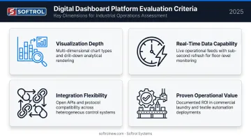
The tools below were evaluated on four criteria:
- Visualization depth — range and clarity of chart types, dashboards, and drill-down views
- Real-time data capability — latency, live feed support, and alert configuration
- Integration flexibility — compatibility with industrial data sources, APIs, and existing systems
- Proven operational value — documented results in manufacturing or industrial environments
Best Digital Dashboard Software for Data Visualization
Tableau
Tableau (by Salesforce) is one of the most widely adopted data visualization platforms, built for analyst-led exploration across industries. It handles large, complex datasets well and produces presentation-quality visuals that work for both operational reporting and executive briefings.
Strengths: Multi-source data blending, interactive drill-downs, and the Tableau Pulse feature (generally available since February 2024) that uses generative AI to deliver metric summaries and anomaly explanations via email, Slack, and in-app digests.
Limitations: Requires technical expertise to configure and govern effectively. Plant managers without BI backgrounds will struggle with self-service authoring. Pulse metric setup requires Creator or publishing Explorer roles plus admin AI enablement — not plug-and-play for operations teams.
| Attribute | Details |
|---|---|
| Best For | Data analysts and BI teams needing advanced visualization and exploratory analysis |
| Key Features | Multi-source data blending, interactive drill-downs, Tableau Pulse AI insights, broad connector library |
| Pricing | Starts at $75/user/month (Creator); Explorer at $42, Viewer at $15 — billed annually |
Microsoft Power BI
Power BI is Microsoft's cloud analytics platform, built for organizations running on the Microsoft 365 and Azure stack. Its tight integration with Excel, Teams, SharePoint, and Azure makes it a natural extension for companies already embedded in that ecosystem.
Strengths: Copilot AI (generally available since May 2024) enables natural language report creation and summaries. Drag-and-drop interface lowers the barrier for non-technical users. At $14/user/month for Pro (updated April 2025), it's one of the most cost-accessible BI platforms available.
Limitations: Pro tier carries meaningful constraints for industrial scale — 1 GB per imported semantic model and a maximum of eight scheduled refreshes per day on shared capacity. Larger datasets and higher refresh frequencies require Premium or Fabric capacity, which significantly increases cost.
| Attribute | Details |
|---|---|
| Best For | Organizations embedded in the Microsoft ecosystem seeking affordable, cross-department dashboards |
| Key Features | Drag-and-drop interface, Copilot AI, real-time streaming datasets, 500+ data source connectors, Teams embedding |
| Pricing | Pro at $14/user/month; Premium Per User at $24/user/month (as of April 2025); enterprise capacity via Fabric F-SKUs |
Domo
Domo is an end-to-end cloud BI platform built for organizations tired of managing multiple disconnected data tools. It unifies data integration, visualization, AI-powered querying, and governance in a single environment.
Strengths: 1,000+ pre-built connectors, a semantic layer that enforces consistent KPI definitions across teams and AI tools, and AI Chat (generally available November 2024) that answers natural language queries with narrative or visual responses. Mobile-ready dashboards make it practical for managers who need visibility away from their desks.
Limitations: Consumption-based pricing — credits covering storage, queries, and workflows — requires careful modeling before deployment. Cost can escalate for high-volume workloads, making it less predictable than per-seat licensing for smaller teams.
| Attribute | Details |
|---|---|
| Best For | Mid-to-enterprise organizations needing unified data integration, real-time dashboards, and AI-driven insights |
| Key Features | 1,000+ connectors, AI Chat, semantic layer, mobile dashboards, row-level security |
| Pricing | Consumption-based, credit model; pricing available upon request |
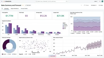
Grafana
Grafana is an open-source visualization platform built for real-time operational and infrastructure monitoring. Its natural home is DevOps and IT observability, but it has a credible secondary fit in industrial automation — tracking asset status, temperatures, OEE metrics, and machine telemetry from sensors and PLC systems.
Strengths: Sub-second streaming data visualization from Prometheus, InfluxDB, Elasticsearch, and dozens of other time-series sources. Free to self-host. Plugin ecosystem extends coverage to additional operational data sources. Configurable alerting built in.
Limitations: Self-hosting requires DevOps resources to manage deployment, authentication, database setup, backups, and high-availability configuration. It is not designed for business analytics or non-technical operational staff. Grafana Cloud offers a managed path — Free tier at $0, Pro from $19/month plus usage, Enterprise from a $25,000 annual commitment.
| Attribute | Details |
|---|---|
| Best For | IT and operations teams monitoring real-time machine, infrastructure, or plant-floor data streams |
| Key Features | Sub-second real-time streaming, plugin ecosystem, configurable alerts, self-hosted or Grafana Cloud options |
| Pricing | Free (self-hosted OSS); Grafana Cloud Pro from $19/month plus usage; Enterprise from $25,000/year |
Softrol LOIS (Laundry Operation Information System)
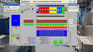
Softrol Systems has built automation hardware for industrial laundry operations since 1987. LOIS is the information layer on top of that hardware — a monitoring platform built specifically for industrial laundry and uniform rental operations that integrates natively with Softrol's automation equipment.
What sets LOIS apart:
- Native hardware integration — LOIS connects directly to Softrol's AutoPulse wash aisle controls, Catalyst/ChemPulse chemical dispensing systems, garment sortation equipment, and rail automation. No middleware, no custom ETL pipelines.
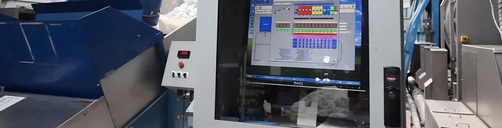
- Pan-N-Zoom rail visualization — Plant managers see a to-scale, real-time layout of their entire rail system. Zooming into individual components reveals I/O status, item-specific data, and preventative maintenance information. Parts quotation requests can be initiated directly from the interface.
- 24/7 remote access — Browser-based access from any smartphone, tablet, or PC. No dedicated app required. Multi-site operators can monitor multiple facilities from a single user account.
- Real-time email alerts — Critical operational threshold breaches trigger immediate notifications to designated email addresses, keeping managers informed without requiring constant manual monitoring.
- UtiliPulse integration — Water, natural gas, and electricity consumption tracked alongside production data within the LOIS ecosystem.
Why Purpose-Built Beats Generic BI for Industrial Laundry
Connecting Tableau or Power BI to wash aisle controls, chemical systems, and rail automation requires custom integration work, data transformation, and ongoing maintenance. LOIS does this natively because the hardware and software were built by the same team.
LOIS is available for both local and cloud-based installation, sold on a purchase model rather than a subscription. It's also modular — existing Softrol customers can add LOIS on top of installed hardware without a full system overhaul.
| Attribute | Details |
|---|---|
| Best For | Industrial laundries, uniform rental companies, and healthcare/hospitality linen services needing plant performance visibility built for their operations |
| Key Features | Real-time remote access, Pan-N-Zoom rail visualization, email alerts, native integration with Softrol automation hardware (chemical systems, wash aisle controls, sortation) |
| Pricing | Available upon request; purchase model, local or cloud deployment |
Key Features to Look for in Digital Dashboard Software
Real-Time Data Refresh and Alerts
Waiting for end-of-day reports means reacting to problems that have already grown. Look for:
- Configurable refresh intervals matched to your operation's pace
- Threshold-based alerts via email or mobile push
- Event-driven triggers (not just scheduled polling) for critical failures
Data Source Integration
A dashboard is only as useful as the data feeding it. Evaluate:
- Native connectors to your existing systems (ERP, MES, PLC outputs, or industry-specific automation hardware)
- API access and incremental refresh support
- What happens when source system schemas change — does the connection break?
Visualization Depth and Customization
Different roles need different views:
- Operations teams — gauges, trend lines, threshold indicators
- Executives — high-level KPI scorecards
- Analysts — drill-downs and cohort comparisons
Prioritize platforms that let you match chart type to decision type without requiring developer support.
User Roles and Access Controls
Confirm the platform supports role-based access. A well-structured permission model typically scopes access like this:
- Plant managers see only their facility's data
- Regional directors see their region's performance
- Executives see the full picture across all locations
For regulated industries — healthcare laundry, hospitality linen services — also check for SSO integration and audit trail capabilities to meet compliance requirements.
Mobile Accessibility
For managers who aren't desk-bound, dashboards must work on mobile without sacrificing usability. When evaluating mobile support, check:
- Whether the platform offers a dedicated app or a browser-optimized layout
- Readability on smaller screens (not just scaled-down desktop views)
- Alert delivery via mobile push notifications for time-sensitive thresholds
How We Chose the Best Digital Dashboard Software
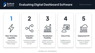
Tools in this guide were evaluated on five dimensions:
- Real-time data capability — refresh rates, streaming support, alert delivery speed
- Integration breadth — native connectors to operational and industrial data sources
- Visualization flexibility — chart types, customization, and suitability for non-technical users
- Ease of use — whether plant floor staff can act on dashboards without analyst support
- Deployment fit — proven use in relevant operational or industrial environments
One common mistake in dashboard selection is choosing based on brand recognition rather than operational fit. Tableau and Power BI earn their Gartner Leaders positioning for strong reasons — but neither was designed with wash aisle controls or rail automation in mind. Grafana handles streaming time-series data well, but it carries real DevOps overhead to deploy and maintain.
The factors that actually move the needle are operational:
- Real-time alerting reduces unplanned downtime
- Role-based access improves accountability across facilities
- Mobile access keeps remote managers informed between site visits
- Purpose-built integrations reduce implementation risk and ongoing maintenance burden
For organizations with complex industrial operations, evaluating purpose-built operational dashboards alongside general BI platforms — rather than defaulting to whichever tool the IT team already knows — often surfaces a better fit that generic shortlists miss entirely.
Conclusion
The best digital dashboard software isn't necessarily the most feature-rich or the most recognized brand. It's the one that connects to your actual data sources, shows the KPIs your team acts on daily, and puts real-time visibility in front of the people who drive operational outcomes.
For cross-department analytics across an enterprise — finance, sales, operations, HR — a general BI platform like Power BI or Domo will serve you well. For plant-floor monitoring in a textile services or industrial laundry environment, adapting a general BI tool to proprietary automation hardware carries real integration costs that are easy to underestimate during the selection process.
Softrol's LOIS platform sidesteps that complexity entirely. It integrates natively with the automation hardware already running your wash aisles, chemical systems, and rail operations — built from the ground up for that environment, not retrofitted to it.
To see how LOIS works with your existing Softrol infrastructure, contact Softrol Systems to request a demo or speak with the sales team directly.
Frequently Asked Questions
What is a digital dashboard?
A digital dashboard is a data visualization interface that aggregates information from multiple sources and displays it as charts, graphs, and KPI indicators in a single centralized view. This gives managers immediate visibility into operational performance without waiting for manual reports.
What is real-time data visualization?
Real-time data visualization displays live data as it is generated, updating automatically as new inputs arrive, so managers can monitor operational performance and respond to issues as they occur.
What features should I look for in industrial dashboard software?
Prioritize real-time data refresh, native integration with plant management or automation systems, configurable threshold-based alerts, mobile accessibility, and role-based access controls — these are the capabilities that matter most when plant-floor conditions change fast and different stakeholders need tailored views of the same data.
How is an operational dashboard different from a business intelligence dashboard?
Operational dashboards focus on current, real-time status — this shift, this hour — for frontline decision-making. BI dashboards emphasize historical trends, cross-department analysis, and strategic reporting over longer timeframes. Most industrial environments benefit from both, though they serve different decision cycles.
Can digital dashboard software integrate with plant management systems?
Not all platforms integrate equally. General BI tools connect via APIs and ETL pipelines, which typically requires custom development for proprietary automation hardware. Purpose-built solutions like Softrol's LOIS connect directly and natively with industrial automation hardware — including chemical dispensing systems, wash aisle controls, and rail automation — without requiring middleware.
What KPIs should an industrial laundry operation track on a dashboard?
Key metrics include pieces per labor hour, wash cycle throughput, chemical consumption per unit, water and energy usage, equipment uptime, and labor efficiency by operator. With Softrol's LOIS and integrated UtiliPulse module, utility consumption data — water, natural gas, and electricity — can be tracked alongside production metrics in the same operational framework.