This is the pain point behind nearly every leadership dashboard: information that shows yesterday's problems instead of tomorrow's opportunities.
The scale of the issue goes beyond one team's spreadsheet habit. In a 2023 study of more than 14,000 business leaders across 17 countries, 70% said they had abandoned a decision entirely because the available data felt overwhelming, and 77% said the dashboards they receive don't relate to the decisions they actually need to make.
For businesses where sales performance and plant capacity are tightly linked, like industrial laundries and textile services, that lag can mean missed delivery windows and lost contracts.
This guide covers what a custom sales performance dashboard actually is, the KPIs it should track, how needs shift by leadership role, and a step-by-step process for building one that gets used.
Key Takeaways
- Custom dashboards swap static, generic reports for real-time, role-specific views tied to revenue drivers.
- Capping dashboards at 5-7 focused KPIs keeps leadership focused on what matters most.
- Reps, managers, executives, and sales operations teams each need a distinct view built around their own decisions.
- The 5-second rule means the most critical insight should be obvious at a glance, not hidden behind clutter.
- Match your dashboard tool to your data sources and team size instead of chasing trending platforms.
What Is a Custom Sales Performance Dashboard — and Why Leaders Need One
A custom sales performance dashboard is a live visual reporting tool built around your organization's specific KPIs, sales process, and leadership structure. Instead of exporting a spreadsheet every Friday, it pulls data directly from your CRM, ERP, and operational systems, so the numbers on screen reflect what's happening right now.
The word "custom" matters here. Off-the-shelf templates assume every business measures revenue the same way. They don't. A SaaS company tracks subscription renewals. A distributor tracks deal pipeline. An industrial laundry or uniform rental service tracks something different entirely: production and delivery throughput, because sales performance and plant capacity are the same conversation.
Why Generic Dashboards Fall Short
Most leaders aren't short on data. They're short on relevant data.
According to Salesforce's 2023 survey of 7,775 sales professionals, reps used an average of 10 different tools to close deals, and 66% felt overwhelmed by their own tool stack. Stack a generic dashboard on top of that sprawl, and leaders end up scrolling past metrics that have nothing to do with the decision in front of them.
Real-time visibility flips that equation. When leaders see performance shifts as they happen instead of a week later, they can adjust pricing, staffing, or delivery schedules before small issues become missed commitments.
An Industry-Specific Example
In operationally intensive sectors like textile services, "sales performance" cannot be separated from plant throughput and on-time delivery capacity. If a wash aisle bottleneck slows output, that same week's shipments and customer commitments are at risk, whether or not anyone updates a sales report.
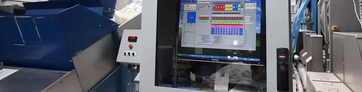
This is where systems like Softrol's LOIS come in. LOIS gives plant leaders and executives real-time, remote access to production data, employee performance, and machine utilization from any device, 24/7. It doesn't replace a sales dashboard; it feeds the operational half of the picture that production-linked businesses need to see alongside revenue numbers.
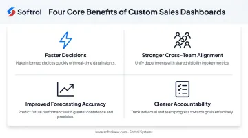
The core benefits of custom dashboards break into four categories:
- Faster decisions: issues surface as they emerge, not after a reporting cycle closes
- Stronger cross-team alignment: sales, operations, and finance work from the same live numbers
- Improved forecasting accuracy: built on current data instead of a stale snapshot
- Clearer accountability: performance gaps are visible to the people who can actually fix them
Essential KPIs and Components Every Leader's Dashboard Should Include
More metrics don't mean more clarity. They usually mean the opposite.
Gartner recommends limiting dashboards to no more than five KPIs per business driver, warning that information overload makes it harder to identify what should actually prompt action. For most leadership dashboards, that translates into a practical cap of 5-7 focused metrics total.
Revenue and Pipeline Metrics
- Total revenue and revenue growth rate — the baseline health check for the business
- Win rate — how efficiently pipeline converts into closed deals
- Pipeline value and sales cycle length — how much revenue is in motion and how fast it's moving
- Throughput/capacity metrics — for production-linked models like industrial laundry order fulfillment, this determines whether pipeline can even be delivered on
Activity, Conversion, and Retention Metrics
- Calls, meetings, and demos completed — leading indicators of future revenue, not just current performance
- Lead-to-opportunity rate and response time — how efficiently the funnel converts and how fast reps engage
- CAC and average deal size — what it costs to win business and how big that business typically is
- Renewal/retention rate — critical for recurring-revenue models like uniform or linen rental services, where a lost account is a lost year of revenue
Non-Negotiable Dashboard Components
Beyond the metrics themselves, a dashboard needs specific functionality to earn daily use:
- Real-time data refresh: leaders act on current numbers, not last week's
- Drill-down capability: the ability to click from a summary number into the underlying detail
- Role-based views: a rep and a CFO need different things from the same data
- Automated threshold alerts: flagging problems before they show up in a scheduled report
Without these four components, even a well-chosen set of KPIs turns back into a static report with better graphics.
Types of Dashboards for Different Leadership Roles
A single dashboard layout can't serve a sales rep, a regional VP, and a plant manager equally well. Each role makes different decisions on a different timeline, using different metrics.
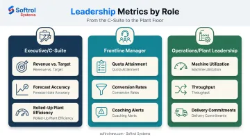
Executive and C-Suite Dashboards
Executives need the roll-up, not the raw feed:
- Total revenue against target
- Forecast accuracy over the past several cycles
- Rolled-up operational and plant efficiency metrics across all locations
An executive dashboard cluttered with rep-level call counts defeats the purpose. It should answer one question fast: are we on track, and where's the risk?
Frontline Manager and Team Dashboards
Frontline managers live closer to the day-to-day, and their dashboards should reflect that:
- Quota attainment by rep and by team
- Team-level conversion rates at each pipeline stage
- Coaching-focused breakdowns that surface underperformance before it shows up in monthly numbers
A manager doesn't need forecast modeling. They need to know which rep needs a coaching conversation this week.
Operations and Plant Leadership Dashboards
This is where production-driven industries diverge sharply from typical B2B sales models. In textile services and industrial laundry operations, plant leadership dashboards need to blend two data sets usually kept separate: plant performance metrics (uptime, throughput) and sales/delivery commitments (what's been promised, and when).
Softrol's LOIS platform is built around exactly this overlap. It gives operations leaders real-time visibility into machine utilization, employee performance, and production output, the operational side of a promise the sales team already made. When both views live in one place, plant leaders can catch a slowdown before it becomes a missed delivery.
How to Build a Custom Sales Performance Dashboard: Step-by-Step
Building a dashboard that leaders actually use, rather than ignore after week two, follows a fairly consistent process.
Identify the must-track KPIs. Start with your business model and each leadership tier's decision-making cadence. Use the KPI categories above as a starting checklist, not a final list.
Audit and connect your data sources. Map where your numbers actually live: CRM, ERP, plant/operations systems, financial software. Prioritize automated syncing over manual pulls. If someone has to export a spreadsheet to feed the dashboard, you've rebuilt the same problem with a nicer front end.
Design role-based views. Don't build one dashboard and hope it fits everyone. Map each leadership tier to the metrics tied to their actual decisions.
Apply visualization best practices. Match the chart type to the data and the audience. Funnel views suit conversion data; heat maps suit capacity and utilization across multiple plants.
Set automated alerts and performance thresholds. Instead of discovering a problem in next week's report, leaders should get notified the moment a metric crosses a defined threshold. Softrol's LOIS platform applies this same logic on the plant floor, automatically emailing alerts the instant a critical condition arises rather than waiting for a shift report. Sales dashboards should work the same way: flag the threshold breach immediately, not after the fact.
Test with actual users, then iterate. Roll the dashboard out to the people who'll use it daily, gather their feedback, and revisit it regularly.
Skipping step 6 is the most common mistake. Teams build a dashboard, ship it, and never touch it again, even as the business around it changes.
Dashboard Design Best Practices and Choosing the Right Tools
A dashboard only works if leaders can read it in the time it takes to glance at a phone screen.
The 5-Second Rule
Design guidance from Tableau holds that a dashboard should communicate its most critical insight within about five seconds. In practice, that means:
- Prioritizing 1-3 top metrics visually, not ten metrics competing for attention
- Using color-coding sparingly, reserved for conditions that need a response
- Cutting decorative elements that don't carry information
If a viewer has to hunt for the number that matters, the dashboard has already failed its main job.
Matching the Tool to the Team
There's no single "best" dashboard platform, only a best fit for your team size, technical skill, and data sources.
| Tool type | Best for | Typical starting cost |
|---|---|---|
| No-code drag-and-drop | Small teams, simple data sources | Free to roughly $9/user/month |
| Advanced BI platforms | Data-heavy organizations with dedicated analysts | Roughly $14 to $115/user/month by tier |
| Industry-specific/embedded systems | Operationally complex businesses with production data | Custom quote based on scope |
For plants running complex production floors, generic BI tools often hit a wall. They visualize CRM data well but weren't built to also ingest wash aisle throughput or garment sortation rates.
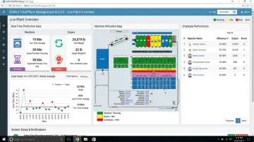
That's the gap that purpose-built platforms like Softrol's Total Plant Management and LOIS are designed to close. These systems unify production data with the operational metrics that determine whether sales commitments can actually be fulfilled.
Before You Commit
Check any tool against three questions before signing a contract:
- Does pricing scale with your team, or will costs jump sharply at the next tier?
- Can support handle your specific integrations, not just generic connectors?
- Will this tool still make sense at double your current data volume?
Dashboard pricing spans a wide range, from free entry-level tools to enterprise BI licenses running well over $100 per user per month. Matching cost to actual need matters more than chasing the most popular name.
Frequently Asked Questions
Which service is best for visualizing performance metrics in a dashboard?
It depends on team size, technical skill, and integration needs. No-code tools suit small teams, while advanced BI platforms fit data-heavy organizations. Operationally complex businesses, like industrial laundries, often need industry-specific systems instead.
What is the 5-second rule for dashboards?
It means a viewer should identify the most important insight within five seconds of looking at it. That requires prioritizing key metrics visually and cutting clutter that doesn't carry information.
What KPIs should a sales performance dashboard include?
Most dashboards should cover five categories: revenue, pipeline, activity/conversion, customer/retention, and operational metrics. Limiting the total to 5-7 focused KPIs keeps attention on what actually drives decisions.
How is a custom dashboard different from a standard CRM report?
A CRM report is a static snapshot someone has to generate manually. A custom dashboard pulls live data from multiple sources automatically, so it's current without extra manual work.
How often should dashboard data refresh?
Refresh frequency should match the decision it supports. Daily operational decisions need near-real-time data, while strategic executive reviews often work fine with daily or weekly batch updates.
Can operational data, like plant performance, be included in a sales dashboard?
Yes, and in production-linked businesses it should be. Softrol's LOIS does exactly that, blending plant metrics with sales data to give leaders a full picture of how capacity and delivery affect revenue.